
Homepage design is the digital equivalent of a storefront window; it is the first impression your brand makes on every visitor. Within seconds of landing on your page, a user decides whether to stay and explore or click the “back” button. This split-second decision is driven by a combination of visual appeal, perceived credibility, and the ease with which a visitor can find what they are looking for. To turn casual browsers into loyal customers, your layout must balance aesthetics with strategic functionality.
When you focus on creating a seamless user experience, you remove the friction that prevents conversions. Whether you are running a corporate portfolio, an e-commerce store, or a personal blog, the goal remains the same: guiding the user toward a specific action. By implementing a few high-impact design principles, you can transform a static page into a dynamic sales tool.
1. Master the “Above the Fold” Experience
The area of your website homepage that is visible without scrolling is known as “above the fold.” This is your most valuable real estate. To maximize conversions, you need a clear Value Proposition—a concise statement that tells the visitor exactly what you do, who you do it for, and why you are the best choice.
Avoid vague language. Instead of saying “We provide quality services,” try “We help small businesses double their lead generation in 30 days.” Pair this strong headline with a high-quality hero image or video that evokes the emotion you want your customers to feel. If the visitor understands your value immediately, they are far more likely to scroll down.
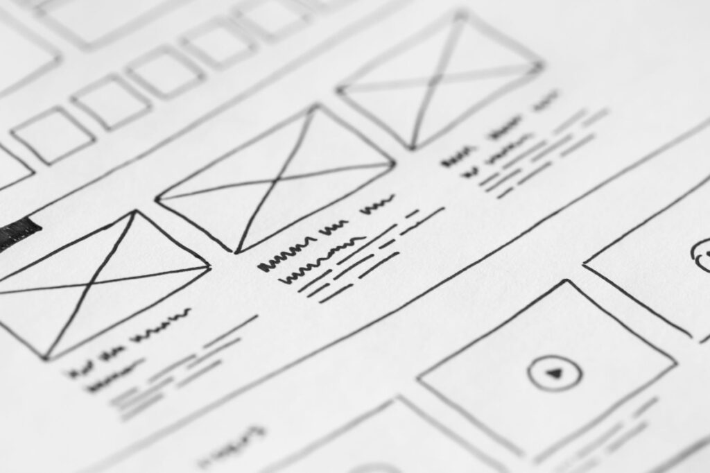
2. Implement Strategic Call-to-Actions (CTAs)
A stunning layout is useless if your visitors don’t know what to do next. Your CTA is the bridge between browsing and converting. To make your CTAs effective, use contrasting colors that pop against your background. If your website uses a blue palette, an orange or yellow button will naturally draw the eye.
Limit the number of primary CTAs to avoid “analysis paralysis.” While it is tempting to ask users to sign up for a newsletter, follow your social media, and buy a product all at once, providing too many choices often leads to no choice at all. Stick to one primary goal (e.g., “Get Started”) and perhaps one secondary goal (e.g., “Learn More”).
3. Prioritize Visual Hierarchy and White Space
One of the most common mistakes in homepage design is overcrowding. When a page is cluttered with text, banners, and pop-ups, the brain becomes overwhelmed, and the user leaves. White space (or negative space) is not “empty” space; it is a design tool that allows your content to breathe.
Use visual hierarchy to guide the eye. Use larger fonts for headings, medium fonts for subheadings, and smaller fonts for body text. By creating a clear path of importance, you lead the user’s gaze from the headline to the benefit list and finally to the CTA button. This logical flow reduces cognitive load and makes the conversion process feel effortless.
4. Optimize for Mobile-First Responsiveness
With a significant portion of web traffic coming from smartphones, your website homepage must look and function perfectly on smaller screens. Responsive design is no longer an option—it is a necessity. A page that loads slowly or requires “pinch-to-zoom” to read text will result in a high bounce rate.
Ensure that your buttons are “thumb-friendly” (large enough to be clicked easily) and that your navigation menu collapses into a clean “hamburger” icon. Test your site across various devices to ensure that the conversion path is just as simple on an iPhone as it is on a desktop computer.
5. Build Trust Through Social Proof
Visitors are naturally skeptical. They want to know that other people have had a positive experience with your brand before they commit. Incorporating social proof directly onto your homepage builds instant credibility.
Effective web design tips for trust-building include:
Client Testimonials: Short, punchy quotes with a name and a photo.
Trust Badges: Logos of well-known companies you have worked with or security certifications.
Case Study Snippets: Brief mentions of specific results you have achieved for clients.
Star Ratings: Visual representations of your average customer rating.
6. Streamline Navigation for Instant Access
If a user cannot find the “Contact” or “Pricing” page within three seconds, you have lost them. Your navigation menu should be intuitive and minimalist. Group related pages together and use clear, descriptive labels.
Avoid using clever or cryptic names for your menu items. While “Our Journey” might sound poetic, “About Us” is what people actually look for. A sticky navigation bar—one that stays at the top of the screen as the user scrolls—is also highly effective, as it keeps the CTA always within reach.
7. Optimize Page Speed and Performance
You can have the most beautiful design in the world, but if it takes six seconds to load, no one will see it. Page speed is a critical factor in both user experience and SEO rankings. Large, unoptimized images are the primary culprits of slow load times.
Use tools to compress your images without losing quality and leverage browser caching to speed up return visits. A fast-loading site signals professionalism and respect for the user’s time, which subconsciously increases the likelihood of a conversion.
By combining these seven strategies, you create a homepage that doesn’t just look professional, but actively works to grow your business. Focus on clarity, speed, and trust, and your website will transition from a digital brochure to a high-converting engine.